Thursday 10 April 2014

Evaluation

Question 1
Embedded below is a time line created by Faye curry on dipity
.

Question 2 
 Embedded below is a prezi that I created, presenting the relationships between our final Music video, Digipak and Magazine advert.

Question 3
Embedded below is a Prezi created by Georgia Pearce
Question 4
Embedded below is a timeline that I created on timetoast.com to present all the Technology and websites and services that we used through out the process of creating our music video, digipak and magazine advert.


Monday 7 April 2014

Final Music video, Digipak and Magazine advert

Directed by Faye Curry, Produced by Kala Hill and Edited by Georgia Pearce


Myself and Georgia created the Final digipak for our album, embedded below is an image of the digipak. We used research of other pop artists digipak's that I gathered to help create our own for Little mix. We used the typical conventions such as The artist name, The album title, The song list, Pictures of the artist and bright colours. The bright colours and fun pictures represent the typical conventions you would expect to see from Little Mix. The font that we chose to use for the Artist name is quiet girly, this connotes that it is a girl band, the name is also large this shows the importance of them. For the name of the album we used a basic font and it is rather small and placed under the artist name, this is because it is not as important, however it is still one the front page as it is important for the customer to know the name of the album. For the song list we decided to use a standard font this was because we knew the font would be rather small and it needed to be legible. We carefully thought out all aspects of the digipak to ensure we created the perfect one for our music video and artist.


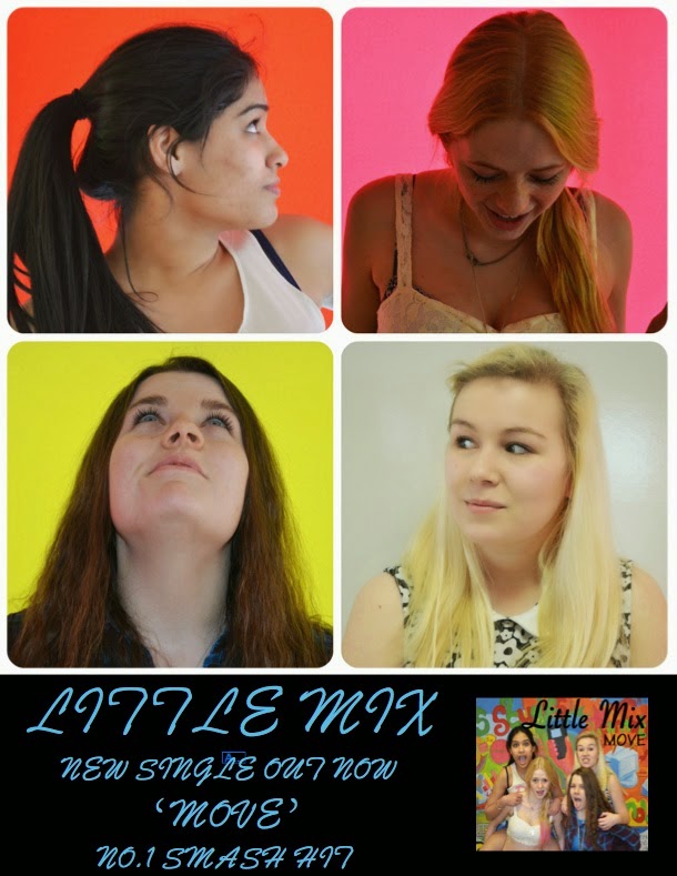
Myself and Faye then went on to create a Magazine advert for advertising our digipak, after Faye had researched into Little mix's previous albums, to create this we again used he research that I had gathered on existing magazine adverts for pop artists promoting their digipaks. The main point to this advert is to promote the release of our digipak, So we used a recognisable image from the digipak and a small image in the corner of the front cover of our digipak. We ensured that we included all the main aspects such as the artist name, The single name and The release date this is all the information that a consumer would need to know to purchase the single.


Sunday 6 April 2014

Process to final Digipak and Magazine advert

First of all I created our basic Digipak and Magazine advert, these were drafts that went by the sketches that I had drawn out, by looking at the completed digital format of these we realized that they needed to be altered to become more professional.
Faye looked into different fronts that we could use.
Below you can see that Fye experimented with many different fonts which she believed followed Little mix's typical typology. We decided on using the fifth text down as we believe that it portrays Little Mix's girly side and highlights that this is a female dominated band. We wanted to keep true to their style and origins.


Above are variations of our magazine advert, once Myself and Faye had created the Magazine advert we were happy with Faye went off to experiment with different colours and wording and imagery placement. From that we decided as a group which one was the best and that would be the one we use as our final piece.

Saturday 5 April 2014

Digipak and Magazine advert sketches

I created these sketches to help towards creating a digital copy of our digipak and magazine advert, this gave us a brief idea of what images to use and the placement of them, I had to consider the placing of the images and which panels they would go onto I had to have the cd disk room on the inside of the digipak. These sketches helped the process of making the digipak and magazine advert on the computer a lot quicker.
 
This image below is an open copy of my drawn out digipak.
 This image below is the front page of the digipak.
 This image below is the open insides of the digipak.
 This image below is the back of the digipak.
This image below is my sketch of the Magazine advert.

Friday 4 April 2014

Comparison of Digipak promotional advert

I have looked at some magazine adverts of pop artists promoting their albums and digipak's to help inspire me to create our own one for our music video.

First of all i looked at Rihanna's magazine advert for her new album.
 On this magazine advert, we are presented with;
The Artists name
The album name
Pictures of the artist
A picture of the album
Particular songs found on album
A different but similar picture to the digipak image
Bright bold colours
Typical aspects that represent that artist
The date of release 

I then looked at Katy Perry's magazine advert for her new album.
On this magazine advert, we are presented with;
The artist name 
The album name
Pictures of the artist
A picture of the album
Particular songs found on album
A different but similar picture to the digipak image
Aspects that we expect to see of this artist
Bright vibrant colours
The release date

From these two digipak adverts I can clearly see what the main aspects of a pop music digipak would be, this is going to help me create the perfect advert for our digipak by including these common aspects.

Tuesday 1 April 2014

Analysis of Digipak's created by different artists

We each individualy analyses various digipak cover to help us start our progress to me creating our digipak.

Me and Georgia looked at Rihanna's "LOUD" digipak cover and analysed the aspects used though out it.
The typical conventions of album digipaks are to have an image of the artist, another convention would be to have the name of the artist and the album presented on the front, For example Rihanna's LOUD digipak has a close up of her face pulling a seductive facial expression, on the front panel with her name and the album name written at the top and bottom of the image. Another prominent convention is that the artists are displayed on the inside and outside, forming a 6 panel digipak in this case, you can create 4 panel digipaks as well. This digipak includes pockets for the CD's and a booklet which include lyrics from tracks on the album.
  The images of Rihanna in her digipak are very sexualised, this is appropriate for her album as it represents her genre of music. The provocative nature is also what will attract her target audience of teenage boys and girls. The photographs used are also clearly edited using photoshop, things such as her skin being perfectly airbrushed and flawless, this is a typical convention for pop music artists as they need to achieve the "perfect" appearance. The colours have also been edited, the red is very bright and vibrant, this colour also insinuates passion, lust and a sexual atmosphere and this colour is a star motif of this artist.
  The typography on her album was carefully chosen the title of the album in capital letters which connotes with the name of the album being LOUD, the artist name is also in capital letter to emphasis the importance of her name, however the font is quiet delicate which prevents the text distracting the consumer from the imagery.

Faye researched into another Rihanna digipak called "Talk that talk" this enables me to compare the two different digipak's from the same pop artist and pick out the most common conventional aspects of a successful digipak cover.


Initially the first typical conventions on this digipak was the use of pictures of Rihanna. It is a typical 6 panel digipak, which had a variety of imagery of the artist Rihanna, secondly having the title of the album placed on the front is a very typical convention of a pop music digipak, along with including; the track list, production company and barcode.
  The imagery on this digipak is a very dominant aspect. These images have captured Rihanna's star motifs, she is typically seen in a provocative and sexual nature. This is apparent in these images as she is showing quiet a lot of skin and is sitting in a sexual manor e.g with her legs open. In addition to the sexuality of the images, having her mouth open in one of the images may be a reference to the title of the album "Talk that talk"
  A lot of the editing has been shown through the images. All of these have a black and white filter, and certain aspects of Rihanna has been brightened e.g her leg this draws the audiences attention to these area and appeals to the male gaze.